arviz.plot_hdi#
- arviz.plot_hdi(x, y=None, hdi_prob=None, hdi_data=None, color='C1', circular=False, smooth=True, smooth_kwargs=None, figsize=None, fill_kwargs=None, plot_kwargs=None, hdi_kwargs=None, ax=None, backend=None, backend_kwargs=None, show=None)[source]#
Plot HDI intervals for regression data.
- Parameters
- xarray-like
Values to plot.
- yarray-like, optional
Values from which to compute the HDI. Assumed shape
(chain, draw, \*shape). Only optional ifhdi_datais present.- hdi_dataarray_like, optional
Precomputed HDI values to use. Assumed shape is
(*x.shape, 2).- hdi_probfloat, optional
Probability for the highest density interval. Defaults to
stats.hdi_probrcParam.- colorstr, optional
Color used for the limits of the HDI and fill. Should be a valid matplotlib color.
- circularbool, optional
Whether to compute the HDI taking into account
xis a circular variable (in the range [-np.pi, np.pi]) or not. Defaults to False (i.e non-circular variables).- smoothboolean, optional
If True the result will be smoothed by first computing a linear interpolation of the data over a regular grid and then applying the Savitzky-Golay filter to the interpolated data. Defaults to True.
- smooth_kwargsdict, optional
Additional keywords modifying the Savitzky-Golay filter. See
scipy.signal.savgol_filter()for details.- figsizetuple
Figure size. If None it will be defined automatically.
- fill_kwargsdict, optional
Keywords passed to
matplotlib.axes.Axes.fill_between()(usefill_kwargs={'alpha': 0}to disable fill) or tobokeh.plotting.Figure.patch().- plot_kwargsdict, optional
HDI limits keyword arguments, passed to
matplotlib.axes.Axes.plot()orbokeh.plotting.Figure.patch().- hdi_kwargsdict, optional
Keyword arguments passed to
hdi(). Ignored ifhdi_datais present.- axaxes, optional
Matplotlib axes or bokeh figures.
- backend{“matplotlib”,”bokeh”}, optional
Select plotting backend.
- backend_kwargsbool, optional
These are kwargs specific to the backend being used, passed to
matplotlib.axes.Axes.plot()orbokeh.plotting.Figure.patch().- showbool, optional
Call backend show function.
- Returns
- axesmatplotlib axes or bokeh figures
See also
hdiCalculate highest density interval (HDI) of array for given probability.
Examples
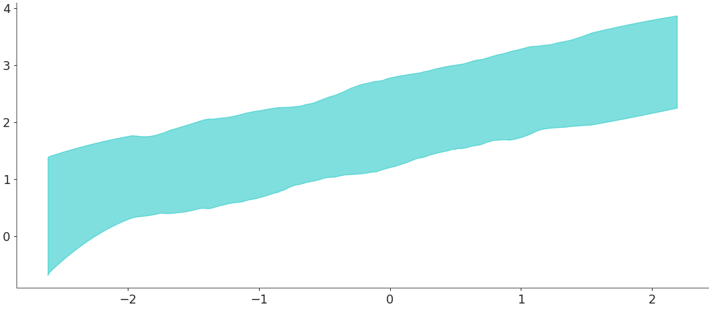
Plot HDI interval of simulated regression data using
yargument:>>> import numpy as np >>> import arviz as az >>> x_data = np.random.normal(0, 1, 100) >>> y_data = np.random.normal(2 + x_data * 0.5, 0.5, size=(2, 50, 100)) >>> az.plot_hdi(x_data, y_data)
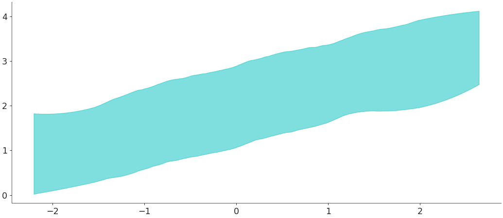
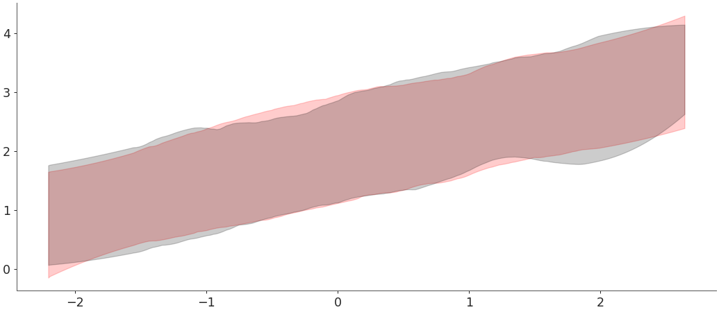
plot_hdican also be given precalculated values with the argumenthdi_data. This example shows how to usehdi()to precalculate the values and pass these values toplot_hdi. Similarly to an example inhdiwe are using theinput_core_dimsargument ofwrap_xarray_ufunc()to manually define the dimensions over which to calculate the HDI.>>> hdi_data = az.hdi(y_data, input_core_dims=[["draw"]]) >>> ax = az.plot_hdi(x_data, hdi_data=hdi_data[0], color="r", fill_kwargs={"alpha": .2}) >>> az.plot_hdi(x_data, hdi_data=hdi_data[1], color="k", ax=ax, fill_kwargs={"alpha": .2})
plot_hdican also be used with Inference Data objects. Here we use the posterior predictive to plot the HDI interval.>>> X = np.random.normal(0,1,100) >>> Y = np.random.normal(2 + X * 0.5, 0.5, size=(2,10,100)) >>> idata = az.from_dict(posterior={"y": Y}, constant_data={"x":X}) >>> x_data = idata.constant_data.x >>> y_data = idata.posterior.y >>> az.plot_hdi(x_data, y_data)