arviz.plot_dot#
- arviz.plot_dot(values, binwidth=None, dotsize=1, stackratio=1, hdi_prob=None, rotated=False, dotcolor='C0', intervalcolor='C3', markersize=None, markercolor='C0', marker='o', figsize=None, linewidth=None, point_estimate='auto', nquantiles=50, quartiles=True, point_interval=None, ax=None, show=None, plot_kwargs=None, backend=None, backend_kwargs=None, **kwargs)[source]#
Plot distribution as dot plot or quantile dot plot.
This function uses the Wilkinson’s Algorithm [1] to allot dots to bins. The quantile dot plots was inspired from the paper When (ish) is My Bus? [2].
- Parameters
- valuesarray-like
Values to plot
- binwidthfloat, optional
Width of the bin for drawing the dot plot.
- dotsizefloat, optional
The size of the dots relative to the bin width. The default, 1, makes dots be just about as wide as the bin width.
- stackratiofloat, optional
The distance between the center of the dots in the same stack relative to the bin height. The default, 1, makes dots in the same stack just touch each other.
- point_intervalbool, optional
Plots the point interval. Uses
hdi_probto plot the HDI interval- point_estimatestr, optional
Plot point estimate per variable. Values should be
mean,median,modeor None. Defaults toautoi.e. it falls back to default set in rcParams.- dotcolorstring, optional
The color of the dots. Should be a valid matplotlib color.
- intervalcolorstring, optional
The color of the interval. Should be a valid matplotlib color.
- linewidthint, optional
Line width throughout. If None it will be autoscaled based on
figsize.- markersizeint, optional
Markersize throughout. If None it will be autoscaled based on
figsize.- markercolor: string, optional
The color of the marker when plot_interval is True. Should be a valid matplotlib color.
- marker: string, optional
The shape of the marker. Valid for matplotlib backend Defaults to “o”.
- hdi_probfloat, optional
Valid only when point_interval is True. Plots HDI for chosen percentage of density. Defaults to
stats.hdi_probrcParam.- rotatedbool, optional
Whether to rotate the dot plot by 90 degrees.
- nquantilesint, optional
Number of quantiles to plot, used for quantile dot plots Defaults to 50.
- quartilesbool, optional
If True then the quartile interval will be plotted with the HDI. Defaults to True.
- figsizetuple, optional
Figure size. If None it will be defined automatically.
- plot_kwargsdict, optional
Keywords passed for customizing the dots. Passed to
matplotlib.patches.Circlein matplotlib andbokeh:bokeh.plotting.Figure.circle()in bokeh- backend: str, optional
Select plotting backend {“matplotlib”,”bokeh”}. Default “matplotlib”.
- axaxes, optional
Matplotlib axes or bokeh figures.
- show: bool, optional
Call backend show function.
- backend_kwargs: dict, optional
These are kwargs specific to the backend being used, passed to
matplotlib.pyplot.subplots()orbokeh.plotting.figure(). For additional documentation check the plotting method of the backend.
- Returns
- axesmatplotlib axes or bokeh figures
See also
plot_distPlot distribution as histogram or kernel density estimates.
References
- 1
Leland Wilkinson (1999) Dot Plots, The American Statistician, 53:3, 276-281, DOI: 10.1080/00031305.1999.10474474
- 2
Matthew Kay, Tara Kola, Jessica R. Hullman, and Sean A. Munson. 2016. When (ish) is My Bus? User-centered Visualizations of Uncertainty in Everyday, Mobile Predictive Systems. DOI:https://doi.org/10.1145/2858036.2858558
Examples
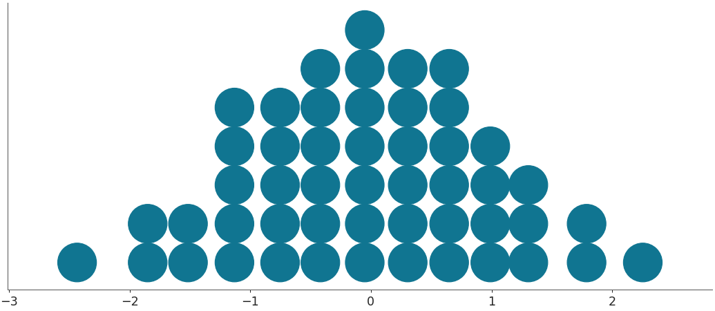
Plot dot plot for a set of data points
>>> import arviz as az
>>> import numpy as np
>>> values = np.random.normal(0, 1, 500)
>>> az.plot_dot(values)
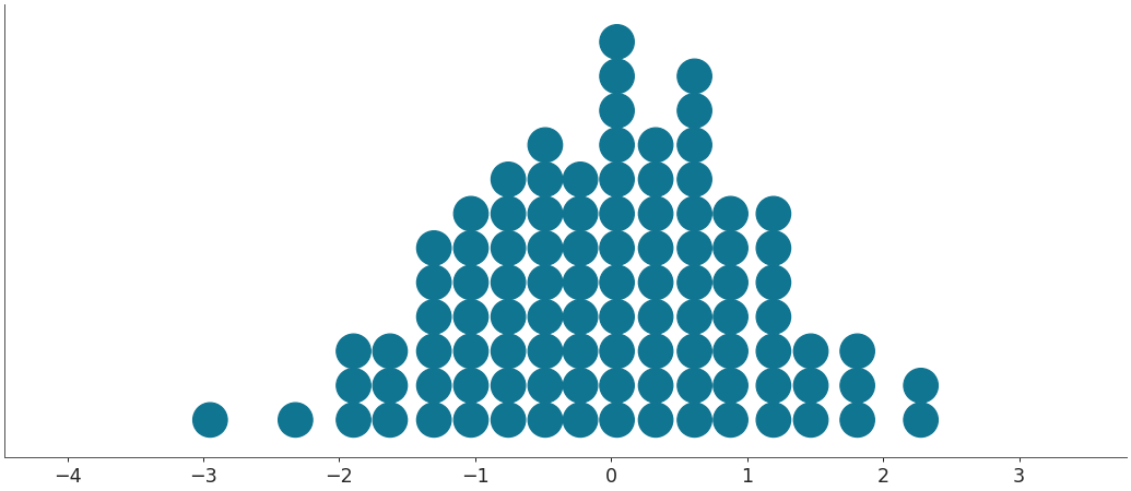
Manually adjust number of quantiles to plot
>>> az.plot_dot(values, nquantiles=100)
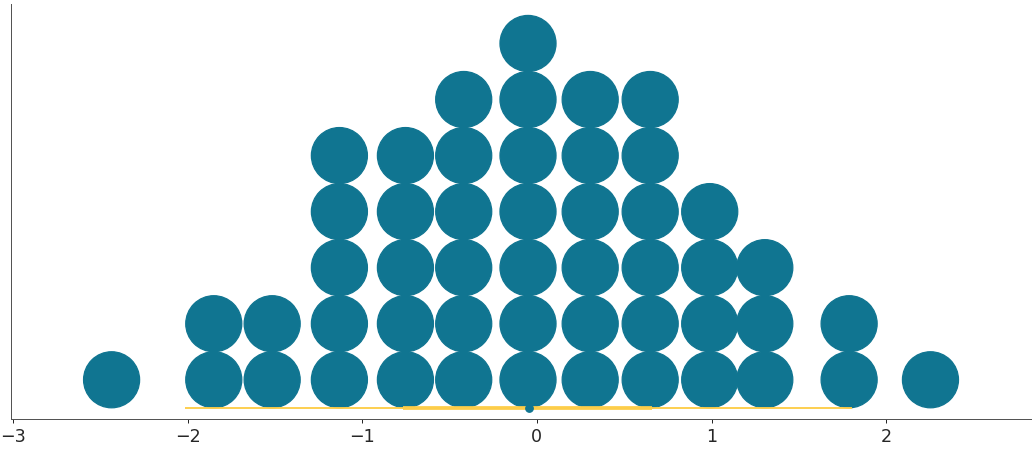
Add a point interval under the dot plot
>>> az.plot_dot(values, point_interval=True)
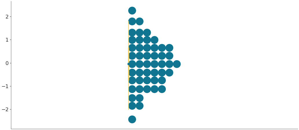
Rotate the dot plots by 90 degrees i.e swap x and y axis
>>> az.plot_dot(values, point_interval=True, rotated=True)